7 UI/UX Tweaks That Instantly Boost Store Conversions: A Complete E-commerce Guide
In today’s competitive digital marketplace, having an attractive e-commerce website is not enough to generate consistent sales. Customers expect a seamless shopping experience, easy navigation, fast-loading pages, clear product information, and a secure checkout process. This is where 7 UI/UX Tweaks That Instantly Boost Store Conversions become essential for online businesses that want to improve customer satisfaction, reduce cart abandonment, and increase sales. A well-designed user interface (UI) and user experience (UX) help customers find products quickly, understand their value, and complete purchases with confidence.
For businesses looking to strengthen their digital presence, working with the Best Digital Marketer & Graphic Designer in Perinthalmanna, Kerala can help create a strategic combination of website design, visual branding, search engine optimization (SEO), and conversion-focused digital marketing. By combining creativity with data-driven strategies, businesses can build e-commerce stores that attract potential customers and encourage them to take action.
Whether you manage a small online shop, a growing fashion brand, or a large e-commerce business, optimizing your website experience can make a meaningful difference. In this blog, we will explore seven practical UI/UX improvements that can help your online store deliver a better shopping experience and improve its conversion potential.
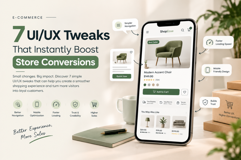
Simplify Website Navigation for a Better Shopping Experience
One of the most important elements of a successful e-commerce website is simple and intuitive navigation. When customers visit an online store, they should be able to find the products they need without confusion. Complicated menus, unclear categories, and excessive navigation options can frustrate visitors and cause them to leave the website before making a purchase. A well-structured navigation system helps users move naturally from the homepage to product categories, individual product pages, and checkout.
To improve website navigation, organize products into clearly defined categories and subcategories. Use descriptive menu labels such as Men’s Fashion, Women’s Clothing, Electronics, Home Accessories, and Best Sellers, depending on your business niche. Include a visible search bar that allows customers to find products by name, category, or relevant keywords. Breadcrumb navigation can also help users understand where they are within the website and return to previous categories easily.
Mobile navigation deserves equal attention because many online shoppers browse and purchase products using smartphones. Use a clean menu, easily accessible search functionality, and touch-friendly buttons to make browsing comfortable on smaller screens. These improvements help customers spend less time searching and more time exploring products.
Implementing 7 UI/UX Tweaks That Instantly Boost Store Conversions begins with removing unnecessary friction from the customer journey. When customers can find what they want quickly, they are more likely to stay on the website, explore additional products, and proceed toward checkout.
Improve Website Loading Speed and Mobile Responsiveness
Website speed plays a significant role in the e-commerce shopping experience. Customers often expect web pages to load quickly, and delays can lead to frustration, reduced engagement, and lost sales opportunities. A slow website can also affect search visibility because page experience and performance are important considerations in Google’s search systems.
To improve loading speed, optimize product images without sacrificing their visual quality. Use modern image formats such as WebP or AVIF where supported, compress large files, reduce unnecessary scripts, and enable browser caching. Choosing reliable hosting and minimizing unnecessary animations can further improve performance. Monitoring Core Web Vitals, including Largest Contentful Paint (LCP), Interaction to Next Paint (INP), and Cumulative Layout Shift (CLS), can help identify technical issues that affect real users.
Mobile responsiveness is equally important. Your website should adapt smoothly to different screen sizes, including smartphones, tablets, laptops, and desktop computers. Product images, descriptions, pricing, navigation menus, and purchase buttons must remain clear and accessible regardless of the device being used.
For example, an online fashion store should display product photographs clearly, allow customers to select sizes easily, and make the Add to Cart button accessible without excessive scrolling. If visitors encounter tiny text, overlapping elements, or slow-loading pages, they may abandon their shopping journey.
By combining fast performance with responsive design, e-commerce businesses can deliver a consistent experience across devices. This improvement supports both customer satisfaction and conversion optimization while creating a stronger foundation for SEO and digital marketing campaigns
Create High-Quality Product Pages With Clear Visuals and Descriptions
Product pages are among the most influential parts of an e-commerce website because they help customers decide whether an item meets their needs. A product page should do more than display a photograph and a price. It should communicate the product’s features, benefits, quality, availability, and value in a way that builds confidence.
Use high-resolution product images that show the item from multiple angles. For clothing and accessories, include lifestyle photographs that demonstrate how the products look when worn or used. For electronics, highlight important details such as size, ports, specifications, and included accessories. Where appropriate, short product videos can help customers understand the product more clearly.
Product descriptions should be informative, readable, and focused on customer benefits. Instead of listing technical features alone, explain how those features solve a problem or improve the customer’s experience. Include essential details such as material, dimensions, colour options, size guides, care instructions, delivery estimates, and return policies.
For SEO, use relevant product names, descriptive headings, meaningful image alt text, and unique product descriptions. Avoid copying identical descriptions across multiple products because original, useful content provides a better experience for both customers and search engines.
Customer reviews and ratings can also support purchasing decisions by providing social proof. Genuine reviews, customer photographs, and clear product information help reduce uncertainty before checkout. However, reviews should be authentic and should not make unsupported claims about product quality.
A professionally designed product page combines strong visuals, useful content, and clear calls to action. These elements help visitors understand what they are buying and make informed decisions, which can contribute to improved conversion rates.
Make the Add to Cart Button Clear and Action-Oriented
The Add to Cart button is a crucial element of an e-commerce website because it encourages visitors to take the next step toward purchasing a product. If the button is difficult to find, visually confusing, or poorly positioned, customers may hesitate or struggle to continue shopping.
Use a contrasting button colour that fits your brand identity while remaining visually distinct from the surrounding content. Keep the button label simple and familiar, such as “Add to Cart,” “Buy Now,” or “Proceed to Checkout.” The wording should accurately reflect the action that follows.
Position the button close to essential product information, including the price, size selection, colour options, and availability. On mobile devices, make sure the button is large enough to tap comfortably. For longer product pages, a sticky Add to Cart button may be useful if it does not obstruct important content or interfere with accessibility.
Interactive feedback can also improve usability. After a customer adds an item to the cart, display a clear confirmation message, update the cart count, or provide an option to continue shopping or proceed to checkout. This helps customers understand that their action was successful.
Avoid placing too many competing buttons near the primary purchase action. When several elements demand attention at once, visitors may become uncertain about what to do next.
A strong call to action does not need complicated effects or aggressive messaging. It needs clear wording, a visible position, and predictable behaviour. Testing different button placements, labels, and designs can help identify which version performs best for your audience.
Simplify the Checkout Process and Reduce Cart Abandonment
A customer may browse several products, compare prices, and add items to their cart but still leave without completing the purchase. One reason is a complicated checkout process. Long forms, unexpected shipping fees, unnecessary account creation, and confusing payment steps can create barriers at the final stage of the buying journey.
To improve checkout usability, request only the information necessary to process an order. Allow guest checkout so customers can purchase without creating an account. Use clear form labels, appropriate keyboard types on mobile devices, helpful error messages, and automatic address suggestions where available.
Display the order summary, product quantities, delivery charges, applicable taxes, discounts, and final price before customers confirm payment. Unexpected costs revealed at the last moment can discourage purchases, so transparent pricing is essential.
Offer relevant payment options based on your target market. For Indian e-commerce stores, this may include UPI, debit and credit cards, net banking, and supported digital wallets, alongside cash on delivery where appropriate. Use reputable payment providers and communicate security information accurately without making misleading guarantees.
A progress indicator can help customers understand how many checkout steps remain. Similarly, allowing users to edit cart items or return to previous steps without losing information can make the process less frustrating.
The goal is to make purchasing straightforward while maintaining the security and accuracy required for online transactions. A simpler checkout can reduce unnecessary friction, improve customer confidence, and help more shoppers complete their orders.
Build Trust With Secure Design, Reviews, and Transparent Policies
Trust is essential in e-commerce because customers often purchase products without seeing them physically or interacting with a salesperson. Before entering personal details or making a payment, shoppers need confidence that the business is legitimate, the products are accurately represented, and their information will be handled appropriately.
Start by using HTTPS across the website and ensuring that your checkout and payment integrations follow appropriate security practices. Display clear contact information, customer support details, shipping information, return policies, refund conditions, and privacy policies. These details should be easy to locate rather than hidden in complicated menus.
Authentic customer testimonials, verified purchase reviews where available, and genuine product photographs can help potential buyers understand what other customers experienced. If your business offers warranties, certifications, or specific delivery commitments, explain them clearly and only make claims you can substantiate.
Professional visual design also contributes to perceived credibility. Consistent typography, balanced spacing, high-quality imagery, and a coherent colour palette create a more polished shopping experience. Broken links, inconsistent layouts, spelling mistakes, and outdated content can undermine customer confidence.
Trust signals should be relevant and accurate. Avoid fake reviews, misleading discount labels, fabricated security badges, or countdown timers that create false urgency. Such practices can damage customer relationships and harm your brand’s reputation.
By combining reliable website security with honest communication and professional design, businesses can create an environment where customers feel more comfortable shopping. Trust-building improvements are especially valuable for new e-commerce brands that are still establishing their reputation.
Use Personalization and Data-Driven Testing to Improve Conversions
Every customer has different interests, preferences, and shopping habits. Personalization can make an e-commerce website more relevant by helping shoppers discover products that match their needs. When implemented thoughtfully, it can improve product discovery, encourage repeat visits, and support a more engaging customer experience.
For example, an online store can display related products, recently viewed items, complementary accessories, or relevant recommendations based on browsing behaviour. A customer looking at a laptop might appreciate compatible accessories, while someone browsing skincare products might benefit from related items within the same product range.
Personalization should remain useful rather than intrusive. Give customers appropriate control over their preferences, respect privacy requirements, and avoid collecting unnecessary personal information. Recommendations should also be clearly distinguished from paid placements where applicable.
Data-driven testing is another effective way to improve an e-commerce website. Use analytics tools to understand how visitors interact with landing pages, product pages, shopping carts, and checkout forms. Review metrics such as conversion rate, cart abandonment rate, average order value, and revenue per visitor to identify potential areas for improvement.
A/B testing allows you to compare two versions of a page element, such as a headline, product image, call-to-action button, or checkout layout. Run controlled tests with a clear objective, enough data to make a meaningful comparison, and a defined success metric. Avoid assuming that a design change will improve sales simply because it looks more attractive.
This approach turns UI/UX optimization into an ongoing process. Rather than relying entirely on personal opinions, businesses can use customer behaviour and measured results to guide their design decisions.
How These 7 UI/UX Tweaks That Instantly Boost Store Conversions Work Together
The most effective e-commerce optimization strategy considers the entire customer journey instead of treating each design element separately. Website navigation helps visitors discover products, while fast loading and responsive layouts keep the experience smooth. High-quality product pages communicate value, and clear calls to action guide shoppers toward purchasing.
A simplified checkout process helps customers complete orders with fewer obstacles. Trust signals reduce uncertainty, while personalization and analytics make it possible to refine the experience over time.
For instance, an online store may attract substantial traffic through SEO and paid advertising but still generate relatively few sales. By reviewing analytics, the business might discover that mobile users frequently leave product pages before adding items to their carts. Improving mobile image presentation, simplifying product selections, and making purchase buttons easier to access may address some of these issues.
However, no single change guarantees an immediate increase in sales. The impact of each improvement depends on the website’s existing problems, customer expectations, product pricing, market competition, and traffic quality. Businesses should prioritize the changes most likely to address observed user difficulties and measure the results after implementation.
When combined strategically, 7 UI/UX Tweaks That Instantly Boost Store Conversions provide a practical framework for making online stores easier to use, more trustworthy, and better equipped to turn visitors into customers.
Why UI/UX Design Matters for E-commerce SEO and Digital Marketing
UI/UX design and digital marketing work best when they support one another. SEO helps potential customers discover an online store through search engines, while paid advertising, social media marketing, and email campaigns bring additional visitors to relevant pages. Once visitors arrive, the website experience influences whether they explore products, engage with the brand, or complete a purchase.
An SEO-friendly e-commerce website should have a logical page structure, descriptive page titles, relevant headings, useful product content, crawlable internal links, and appropriate structured data. Product images should be optimized for performance and include descriptive alternative text where suitable. Mobile usability and technical performance should also be monitored regularly.
At the same time, conversion optimization helps businesses make better use of their existing traffic. If a store attracts visitors but provides confusing navigation or an inconvenient checkout, increasing advertising spend alone may not solve the underlying problem.
Graphic design also contributes to the overall experience. Consistent branding, professional product imagery, readable typography, and well-designed promotional banners help communicate the brand’s identity while maintaining usability. Visual elements should support the shopping journey rather than distract customers from important information.
A coordinated strategy that combines SEO, graphic design, UX research, analytics, and digital advertising can help e-commerce businesses build a stronger online presence. For businesses seeking to improve their visibility and website performance, this integrated approach can support sustainable growth.
Conclusion
Implementing 7 UI/UX Tweaks That Instantly Boost Store Conversions is an important step toward building an e-commerce website that meets customer expectations and supports business growth. From simplifying website navigation and improving loading speed to creating informative product pages, optimizing purchase buttons, streamlining checkout, building trust, and using data-driven personalization, every improvement can help remove barriers in the shopping journey.
The key is to understand your customers and identify the problems that prevent them from completing purchases. Start with the most significant usability issues, make improvements based on real user behaviour, and measure their impact through analytics and controlled testing. Continue refining your website as customer expectations, technology, and market conditions evolve.
For businesses in Perinthalmanna and across Kerala, combining professional graphic design with SEO and digital marketing can create a more cohesive and effective online presence. Working with the Best Digital Marketer & Graphic Designer in Perinthalmanna, Kerala can help businesses develop consistent branding, improve website communication, and implement digital strategies aligned with their business goals.
Ultimately, a successful e-commerce store is not simply a website that looks attractive. It is a website that makes shopping easy, communicates value clearly, earns customer trust, and guides visitors toward informed purchasing decisions. By applying these seven UI/UX improvements consistently, your business can create a better customer experience and build a stronger foundation for long-term e-commerce success.